Warwick Hotels
01/06 - INTRO
02/06 - OVERVIEW
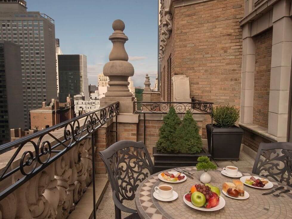
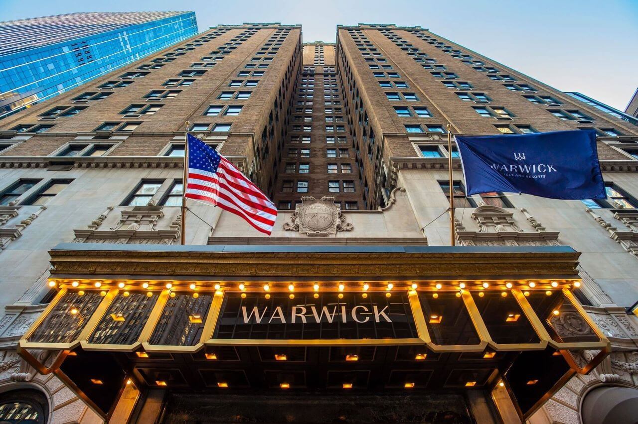
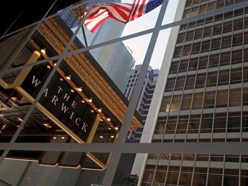
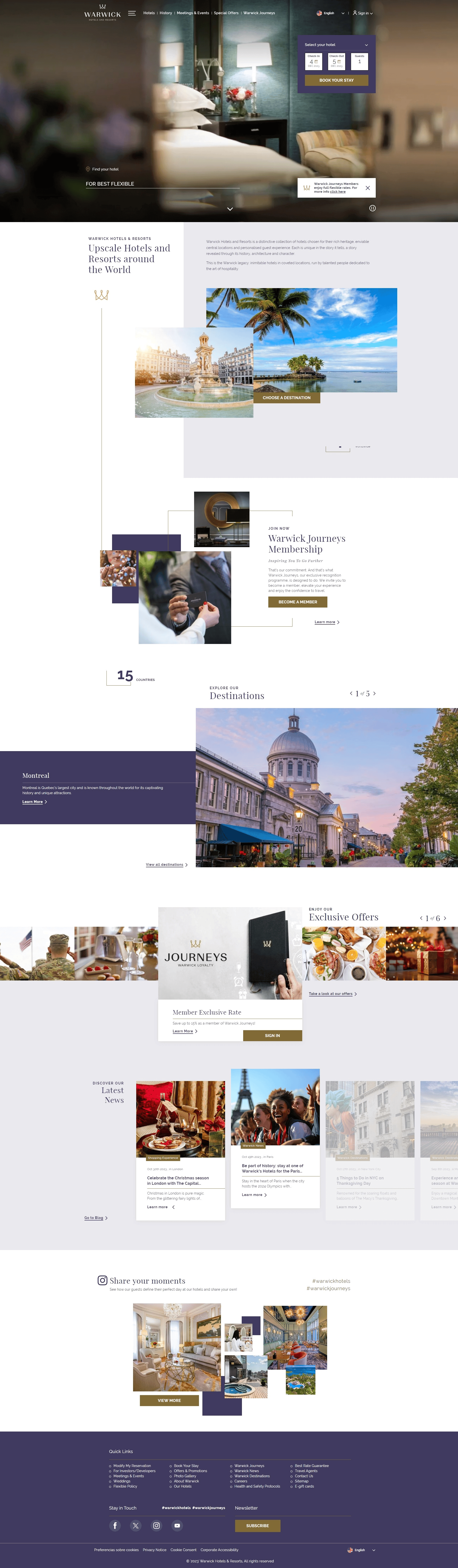
Warwick Hotels and Resorts is a distinctive collection of hotels chosen for their rich heritage, enviable central locations and personalised guest experience. Each is unique in the story it tells, a story revealed through its history, architecture and character.
DESIGN PROCESS
Warwick has been one of the largest and most demanding projects I've worked on. It involves creating a website for the group and all respective properties, complete with a hotel map search feature. Beyond the web pages, there were sub-elements like "Warwick Journeys" for clients, representing another platform within a platform. In terms of design, the goal was to blend the classic style of almost a century ago with contemporary modernity.
03/05 - DESIGN
For Warwick Hotels, there was a bold decision to use purple as the main color, combining serif and sans-serif typography to create a contrast between classic and contemporary elements. This daring choice of color and the juxtaposition of different font styles contribute to giving Warwick Hotels a distinctive and memorable visual identity, making it stand out in the hospitality industry.
COLORS
#403a60
#eae9ed
#816a35
FONTS
Primary font:
Playfair Display
Secondary font:
Raleway
Wanted to highlight the hotel search page on the map as it was a rather complex integration that was resolved quite elegantly. In addition to this screen, you can see the full-screen booking mask before going to the actual booking engine.
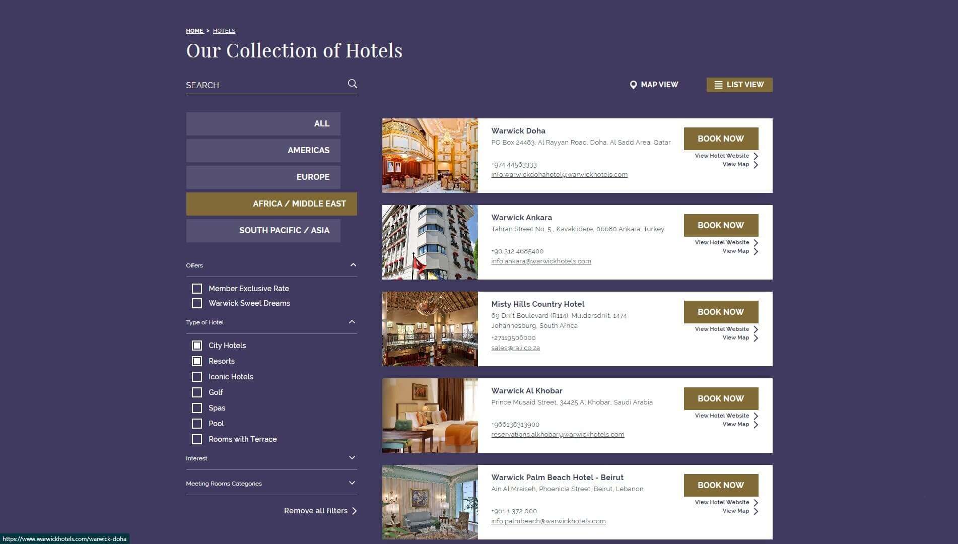
Hotels Collection list view
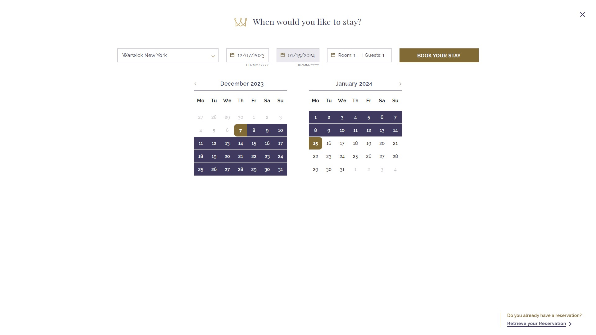
Booking Engine Detail
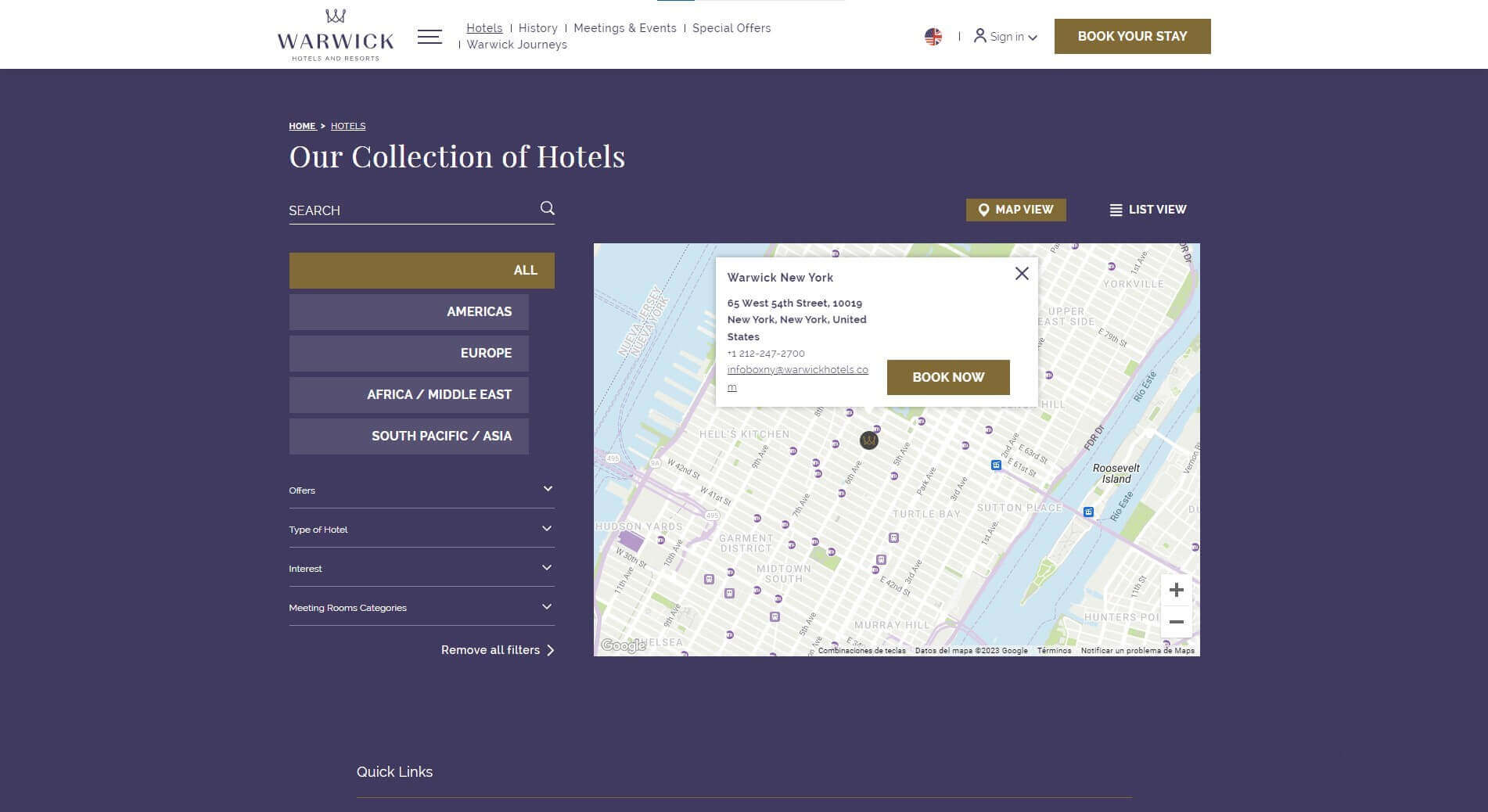
Hotels Collection map view
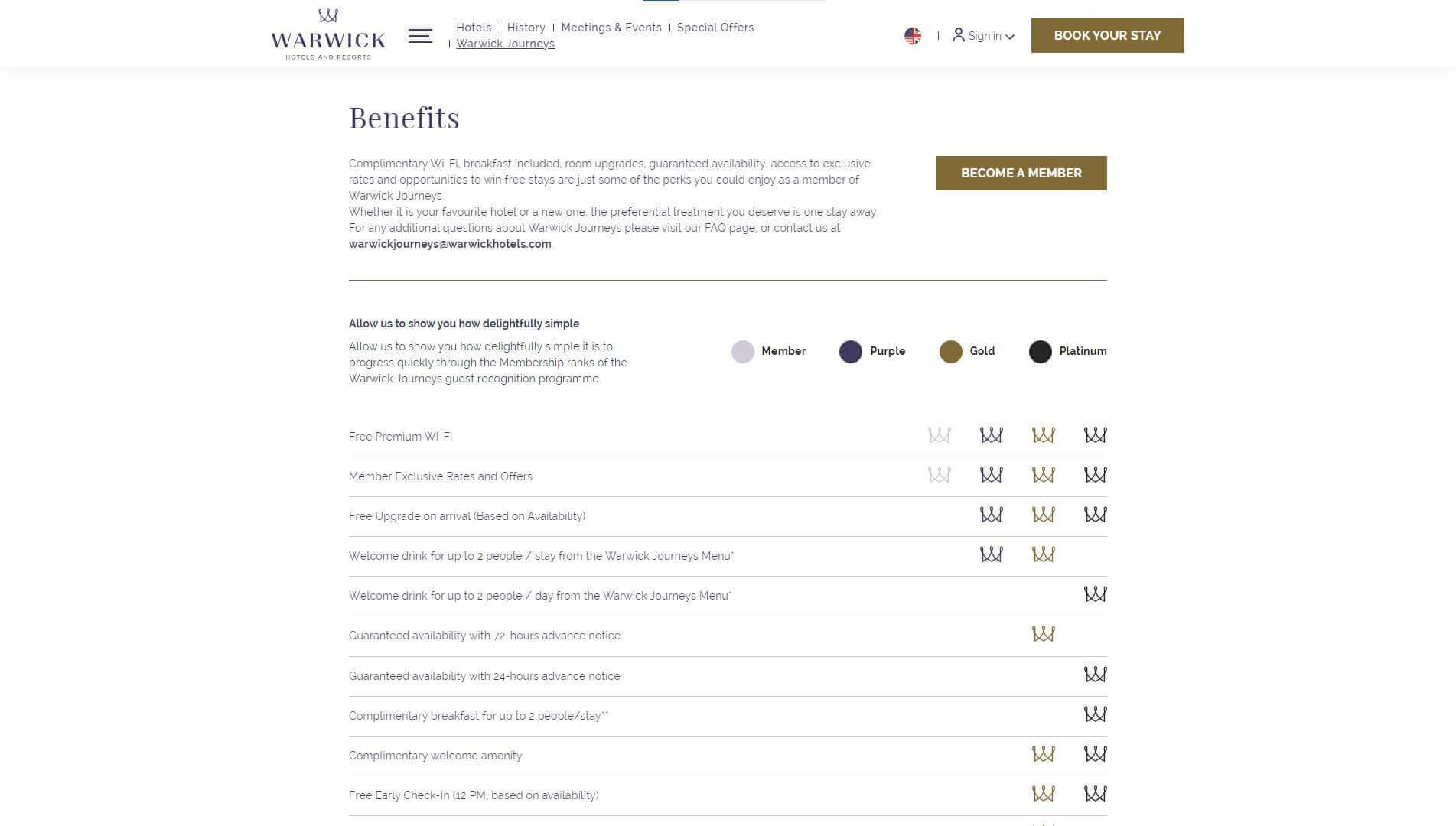
Benefits Page
04/06 - RESPONSIVE
As in the previous screenshots, it's worth highlighting the hotel map search, which has been successfully adapted to the mobile version. As is customary in the hospitality industry, the call-to-action button is always visible on the property's website.
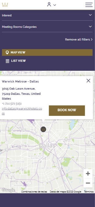
Hotels map view
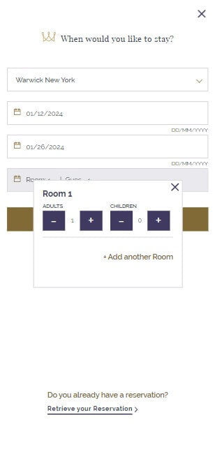
Booking Mask I
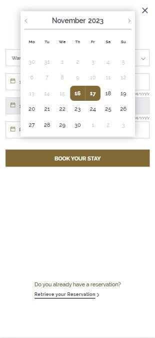
Booking Mask II
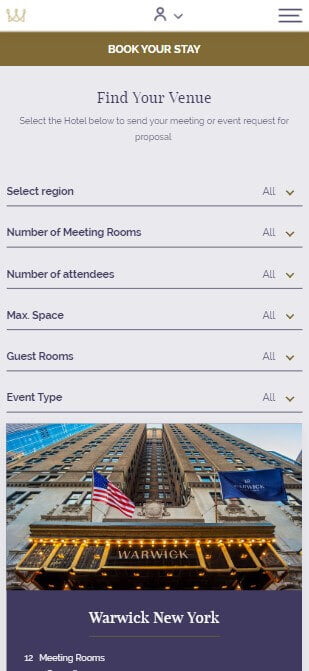
Find venue filters page
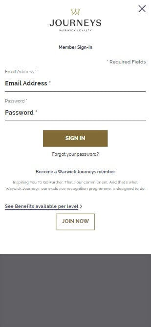
Warwick journeys
05/06 - LINKS